Adventure Academy
A bit of a belated announcement, but the game I helped create is out! I was a designer on this project, as well as tools support.
Learn more about this educational MMO here.
A bit of a belated announcement, but the game I helped create is out! I was a designer on this project, as well as tools support.
Learn more about this educational MMO here.
Hey there!
Cornell College just published my senior profile – check it out here. It features some interview questions about my time at Cornell as well as a couple snazzy photos.
An important part of tech is keeping everything up-to-date. Over the past semester, I have worked with the creator of a Music Fundamentals textbook to begin the process of converting it into a web format.
MFun
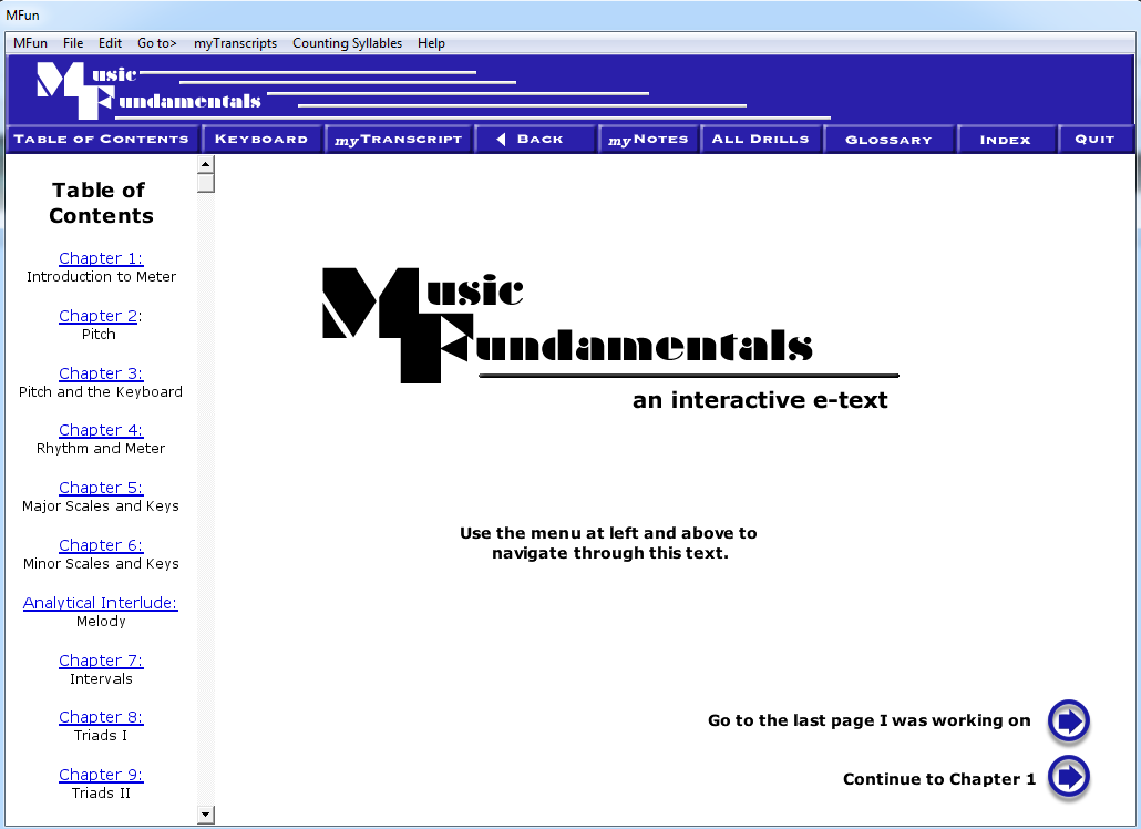
Originally, MFun was created as downloadable software using Adobe Director and Actionscript 2.0 in 2012. As an interactive textbooks, it has exercises at the end of lessons, as well as drills, quizzes, and an option for custom student notes.
Below is a presentation that acts as an overview of the project.
The plan is to completely remake it for the web using HTML, CSS, and JavaScript. Much of it will have to be completely redone without reference, as Director is no longer available, and Actionscript 2.0 is no longer supported. However, this does mean the new version will have a lot of flexibility in terms of design choices.
We decided to simplify the menu, as there were many confusing things about the first iteration, but there are also many good things about the original design that we wished to keep.
As things stand, it are still in the mockup stage, trying to perfect a menu system that is both modern and also convenient. (Believe it or not, not all popular aspects of modern web design are actually helpful to the end user). Ultimately, we are aiming for something that will last.
One of the major advantages of the digital humanities is the ability to work with and analyze lots of data. Naturally, one wants to visualize that data and analysis results. There are a lot of options out there when it comes tools that aid in data visualization, and some are more intuitive to use than others. While it is wonderful that there are so many tools, it can be difficult to know which ones are best for the job. Their usefulness depends on the type of data being worked with, the overall scope of the project, and how much technical expertise there is on the team.
If you already have the data you want to show and know what kind of visualization you are after, there are several simple chart options available, especially for web display.
Google Charts is a common tool used to make interactive charts on webpages using HTML, CSS, and JavaScript. This may sound a little daunting, but it was designed so that non-coders would still be able to pick it up relatively easily. There is a decent range of available chart types, and all of them are interactive, making them great for integrating into a digital report or webpage. One can either make the data table in the code themselves, or they can link to an online spreadsheet (such as Google Sheets). This is a little limiting in that this is the only way to import data sets, and if one is looking for a more complicated display, it would take a lot more fiddling with code than what might be comfortable. However, it makes great aesthetically pleasing interactive charts for simple needs.
Variance Charts also plots simple charts via HTML and CSS, but attempts to smoothen out the learning curve even further by dropping the need for JavaScript knowledge altogether. It also is a step up from google charts in that you can import csv files, instead of having to link to a google sheet. However, it does not inherently make the charts interactive. It is a good fit for quick charts with little coding knowledge, and still allows for some stylizing. As they state on their own home page, Variance is not the best choice for more complicated visualizations or data sets greater than ~20k rows.
If there are project members who are knowledgeable about JavaScript and the HTML DOM/Canvas, then there are many JavaScript libraries that make custom interactive charts easier and more appealing, such as D3js, Plotlyjs, Highcharts, and ChartJS. D3js in particular can be used for complicated data analysis and mining as well. (Many of the higher-level chart makers are built on D3js). These libraries are a good option when there is a programmer on the team, when showing the data is essential, and when the visual needs a certain level of customization that can’t be reached with simpler tools. There are a huge number of these, so the best way to determine which one will be best is to take a quick glance at each and pick the one that works best for the needs or the project.
For more in-depth analysis or complicated data manipulation, charting tools alone are not going to be the easiest to use. If the project is still in the analysis stage, there are a few good pieces of data analysis software.
Plot.ly is an online graph maker that lets you import data from multiple sources and requires no coding knowledge to use. It does, however, require an account, and does not have the most intuitive interface. But for those looking for something simpler than Tableau or Orange and do not need their more complex analysis capabilities (or is unable to download them), Plot.ly is a great option, especially as coding knowledge is not really needed. If there is a programmer on the project, then Plot.ly also has a JavaScript library to make more customized visualizations. There is a free and paid version.
Tableau is a desktop data visualization software. It lets you either manually define or import data sets from several different filetypes. It allows for many ways to display data, and was specifically created to help with data analysis and visualization. There is a free version (Tableau Public) and a paid version, meaning that the free version students would likely use is a little more limited. It requires no programming experience, but the graphs on Tableau public are all shared to the web publicly, and has limited visual control. However, the interactive visuals can be embedded into other web pages or downloaded as still images.
At first glance, Orange works much in the same way as Tableau, but is free and open source. It also allows for a lot more involved data mining and analysis. However, its user interface is not as easy to pick up, and to do the more involved data analysis requires more expertise. Its visuals are also not quite as sophisticated, but it is a much more robust tool for an aspiring data scientist. It does not require programming to use, but there is the option to do some scripting if one desires.
These are all decent programs, and in most cases there is not going to be a “best tool” for any given task. Yet one should still keep in mind the skillset and end goals when picking tools. In the end, it comes down to what needs to be accomplished, and what one likes to use and is comfortable with.
These past two weeks, I have been at the DHSI (Digital Humanities Summer Institute) conference. It’s not the easiest experience to describe. There are classes, colloquiums, guest speakers, talks called “unconferences”, presentations, and hangouts. The participants by a vast majority are grad students and above. In each of my classes, I’ve had a nice mix of grad students, phd students, full on professors, and a few others. I think it’s safe to say it’s a mostly academic-minded conference, though there is definitely value for non-academics with an interest in digital humanities as well. Something that I found absolutely fantastic is that there was a significant lack of barriers or separation by academic group (ie. if I wished, as an undergrad, I could go to dinner with a professor, a phd student, and a masters student with no weird separation or awkwardness in discussion that one tends to experience otherwise). All in all, a fantastic experience – I learned quite a lot, and gained a ton of inspiration for the future.
The first class I took was 3D modeling, which was essentially intro to SketchUp. We made a nice replica of a building in downtown Victoria:

Here’s the front:

I worked mostly on the back:

I think it all turned out pretty well, for a small group of people who had never used SketchUp before.
The people in this course, by the way, were awesome – Among getting encouraged to become a medievalist, I was able to get a lot of advice and interest about my project, and my impostor syndrome melted away the more I spoke with people.
This second course, Games for Digital Humanists, I decided to take because it’s super relevant to my project, and also, vidja gams are cool. The first day of the course inspired me with many ideas for awesome blog posts, which of course I will obviously write as soon as I have time and my brain isn’t melting (which, by the way, is why I haven’t been keeping up with the weekly updates).
The first few days were spent working on some fascinating theory (I sense a lot of reading in my future), and then the class split into groups. The instructors of this course invented a game to create games, and so we played this game to come up with a game design. It’s really neat – the last time they taught this course one of the groups took their idea to a kickstarter! (It got fully funded, too). The idea we prototyped was a storytelling game along the same lines as dix-it (fantastic game, by the way, especially with the right people). A group of players draw one protagonist card and one setting card. Then a timer is set and one player draws a “bad” card and has to say a line or two of a story (using the setting and protag) while trying to put a good spin on the bad card. The next player then draws a bad card and does the same thing, trying to build off the previous player’s story bit. The end goal is to make the story end on a happy note.

Messy design process (complete with fish)!
We made paper cards and playtested a few rounds – not bad! Something I’d try with the right group of people. I don’t think we’ll be making any kickstarters, though we learned a lot. It was essentially a super short project process, complete with bumps and hurdles. Not a bad ending for just a few days. I also was able to ask some advice about my project from the instructors, and I have a much clearer idea of a timeline and the project’s overall future than I did before.
I feel like I have grown a lot from this trip. Here’s hoping the return trip to the US goes well!